Microsoft Logo- History And Evolution
The Microsoft logo has gone through five changes in its history, from its creation to the most recent one introduced in 2012. The company brought a new cyber revolution into the tech industry. A new era of information was introduced after its first launch by different companies. The company develops user computers all software accessories. The whole manufacturing process of a computer is also taken by the company. Every windows computer uses Microsoft-developed software to run it. Microsoft Suit 365 contains Office Apps, Edge Browsers, and Internet Explorer. In this article, we will look over some of the major historical evolutions of the logo.
Microsoft Logo Evolution
The Microsoft logo has undergone several evolutions over the years, reflecting the company’s changing focus and identity. The first logo, which was used from 1975 to 1987, was a simple wordmark consisting of the company name in all capital letters. In 1987, Microsoft introduced a new logo that featured the company name in a 3D perspective font. This perspective logo remained in use until 2012 when Microsoft unveiled a sleek and modern logo that consisted of four squares arranged in a rectangular shape. The current logo is highly having versatility and can be adapted to different formats and sizes, which reflects Microsoft’s commitment to constantly innovating and evolving. As the company continues to grow and change, it is likely that the logo will undergo further changes to reflect its new direction.
Microsoft Logo
The Microsoft logo includes one of the most famous logos on the internet world. The logo is found on every computer using the Windows Operating System. Besides of company’s reputation, the logo has its own value and remembrance to every individual. The Microsoft Office logo is a simple yet stylish design that represents the company’s flagship software suite. The logo consists of a white ‘O’ against a blue background, with a red ‘X’ in the middle. The ‘O’ symbolizes the office suite’s productivity, while the ‘X’ represents its cross-platform compatibility. The blue color signifies reliability, and the overall design conveys a sense of professionalism and quality. The Microsoft Office logo is instantly recognizable and has become synonymous with the brand. It is an effective way of communicating what the company stands for and is an important part of Microsoft’s visual identity.
Microsoft Logo History
During the different time periods, the company carries on changing its logo from one to another phase. The Microsoft logo mainly passed through five main phases of changing its shape and size. Here are the details of its timely evolution and its brief history.
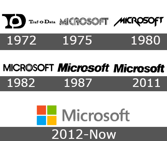
1972: The first logo of the company was designed with its name “Traf-O-Data” in 1972. This was the initial logo of the company. At this time company was not named Microsoft. The logo was designed with great professionality. The first emblem was to symbolize the TOD with logo language.
1975: This original logo of Microsoft was launched in 1975, with a language font developed by Bill Gates and his friend. The logo was designed by Simon Daniels. In this logo, the Micro and soft were shown as separate words. The logo also cleared the meaning of the company and its functionality was also predictable through its logo. The words together in a new shape were looking round and equal in shape without having any technical shape error in the company.
1980: The new decade of the 1980s also brought a new innovation in designing and new tools to create your logo. Simon Daniels proposed another wordmark logo. This logo was last on the company wall for two years. This logo was designed in an edge format. The logo was much familial with the video games formats. The logo was a bit difficult to read at first sight as it was written in an ordinary format. The capital black format was written in the new Zelek Font.
1982: In this year the company designed a new logo in the straight equal font of the sans-serif typeface. This Microsoft logo was also designed by Simon Daniels with a mentality to move the company in a straight direction to make it easier to understand. There were extra lines and lines were drawn in the O with a minor o in the center. The lines visually divide the word into two parts. The logo stayed on the company wall for almost six years till 1987.
1987: With a unique design that’s been almost remained unchanged for 30 years, the iconic Microsoft logo is recognized around the world as one of America’s most successful companies. This wordmark written in an italicized Helvetica Black font has just one element-a white cut-out U-shaped thingy on the top left side called “the triangle.” It was created to separate Microsoft from Soft and make people look at our name from a new angle.
2012: The new Microsoft logo is a modern, geometric symbol that takes up less space than it seems. The four small colorful squares make up the bigger picture and provide light-hearted contrast to the gray logo typewritten in Segoe Semi bold sans-serif typeface which has been used since 1997 when they released Windows 98 software platform version. The squares symbolize all of Microsoft’s diverse products, as they are the company’s logo. It makes sense because Windows is Microsoft’s largest source of income and a significant portion of its history.
Microsoft Office Logo
The Microsoft Office logo debuted in 1995. It included a square form with mated component pieces inside (four hues: yellow, red, green, and blue). For the 1997 and 2000 versions of Office, it didn’t very much.
Microsoft Excel Logo
The Microsoft Excel logo is a yellow ellipse with a green wave at the bottom. The wave represents the data that is stored in an Excel spreadsheet, and the ellipse represents the cell that contains the data. The logo is simple and easy to remember, making it an effective tool for branding. The Microsoft Excel brand is one of the most recognizable brands in the world, and the logo helps to reinforce this image. When people see the Microsoft Excel logo, they immediately associate it with quality and reliability. This association helps to give Microsoft Excel a competitive advantage in the marketplace.
Microsoft Word Logo:
The Microsoft Word logo is a white W on a blue background. The W is made up of three lines that intersect in the middle. The top and bottom lines are shorter than the middle line, giving the W a slightly curved shape. The logo was designed by Simon Eglington, a graphic designer from the United Kingdom. The logo was introduced in 1987 and has remained unchanged since then. Microsoft Word is a word processing software program that is part of the Microsoft Office suite of products. It is used by millions of people around the world for tasks such as writing letters, creating resumes, and creating presentations. Microsoft Word is widely considered to be the industry standard for word processing software.
Microsoft PowerPoint Logo:
The Microsoft PowerPoint logo is a stylized P that is meant to represent the company’s initials. The logo has a very simple and clean design, which is meant to convey the company’s professional image. The logo is also meant to be easily recognizable so that people can quickly identify the company’s products. The logo is mainly used on the company’s website and on its products’ packaging. The Microsoft PowerPoint logo is a simple yet effective way to represent the company and its brand. For users, the PowerPoint logo has also an easy and effective approach to create presentation slides.
Conclusion
Microsoft has come a long way in terms of its logo design and branding. Their logo design has evolved over the years as well, adapting to new trends in technology and marketing. The evolution of the Microsoft logo is an interesting case study for any business, as it shows how much can change (and stay the same) over time. We hope you’ve enjoyed this look at the history of the Microsoft logo with interesting phases.

