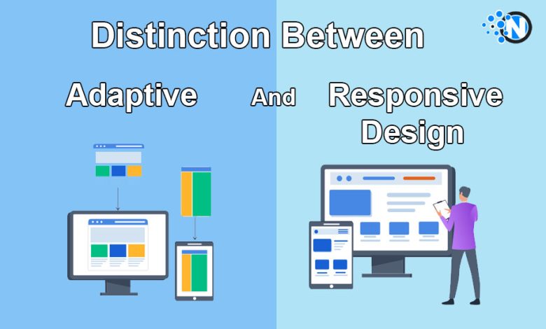
Learning The Distinction Between Adaptive And Responsive Design
Several similarities between the two concepts of adaptive and responsive design lead to confusion among developers. Both design strategies are utilized to optimize the web browsing experience of mobile and desktop users by tweaking the display of a web page’s elements.
Responsive and adaptive website designs virtually alter the behavior of the browser in accordance to the device employed by the user. In the following guide, we aim to provide a comprehensive description of both concepts, using examples to eliminate some confusion.
Both methods rely on the principle of breaking points
Breaking points are found in both categories of design. A breaking point essentially consists of a set of rules that decide the way a web page’s elements are displayed based on the typical screen width of the device. These rules might appear arbitrary, but in reality, they are determined by the most popular screen widths.
Examples of breaking points and layouts
To understand the concept better, let’s take 4 relative breaking points: under 778 pixels, between 778 and 992 pixels, between 992 and 1200 pixels, and over 1200 pixels.

These predefined limits in screen width trigger a more or less significant realignment of the page elements to accommodate the website’s content. The result consists of 4 distinct layouts of the browser’s window. It’s necessary to point out that the value of the limitations can be adjusted manually to conform to the ever-changing popularity of various mobile devices.
Compatibility considerations
Setting the breaking points is possible thanks to a CSS3 language option called a media query. Although most new browsers support the option, older versions like IE 8 do not. However, it’s a minimal setback considering that mobile websites are generally designed for compatibility with modern smartphones, ‘phablets’ and tablets.
Responsive design modus operandi
A responsive design relies on adjustable scaling of the web page’s elements based on the ratio you select for each. Let’s assume that a page comprises 3 distinct columns, 1 primary column occupying 60% of space and 2 secondary columns sharing the remaining 40% equally. What responsive design does is retain these proportions as the dimensions of the display decrease.
However, when the display size is tiny, even the 60% space of the main column would render the content unreadable. In this case, the developer should set media queries that utilize a predetermined breaking point to remove, hide or relocate the secondary columns and permit the primary one to occupy a central, spacious position in the browser’s window.
A standard approach is to ‘elongate’ the page on small-screen mobile devices, in the sense that the secondary content is placed at the bottom of the primary content. Simply put, as screen width decreases, the webpage becomes longer.
Adaptive design modus operandi
Here’s the key distinction between the two concepts: while responsive design is all about element scaling, its adaptive counterpart relies chiefly on fixed element sizes. Therefore, if you have a webpage featuring 3 columns of predefined dimensions, they wouldn’t scale with the screen’s dimensions. The columns would continue to occupy the same amount of space, and when the breaking points are reached, the element snaps in its next designated position.
The bottom line

Responsive design is a universally applicable approach, while adaptive designs yield the best results when utilized in specific device categories. A website that employs adaptive design could reap the full advantages of iPad Minis or iPhones.