eBay Logo – Design And History Of The Company
eBay and eBay logo is well known by everybody across the world as an eCommerce platform. eBay is one of the largest online selling and purchasing multinational online marketplace. It is concluded in one of those companies who debuted selling and buying of goods over the internet. It is a collective network of sellers and buyers around the globe. eBay ensures safe, convenient, transparent trading and accessible procedures for anyone everywhere. Although auctions are a major part of eBay’s sales, fixed-price sales are also a main part of the transaction.
eBay Logo – Historical Overview
The first eBay logo was written, not designed. It shows that Pierre Omidyar didn’t have any sort of design skills. So, It was not a logo in the real term but was written in a straight way. It also shows that he was not sure about the success of his web or was doing this just to experiment.
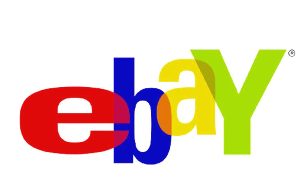
In 1999, the eBay logo was shaped again attractively and professionally. The new logo was different from the old one. It was also the biggest logo change in the company’s history. eBay introduced a colorful emblem into the marketplace. eBay was written respectively as red, blue, yellow, and green to indicate the diversity of the business. The B was replaced as a lower-class digit while Y is written in capital form. All the letters were in overlapped mode to make the logo attractive.
Current eBay Logo
In the new eBay logo capital, ‘Y’ was transformed into lowercase as many designers argue that there is no meaning in putting it as a capital letter. All these floating alphabets were rearranged in a cycle.
Color: The color selected for the new logo was also changed to some extent. The ‘e’ was designed in dark red, ‘b’ was also changed from indigo to sky blue while the last two alphabets remained their previous color.
Font: The eBay logo was written in the Univers font family with a minor change. The font style of the emblem is similar to Univers but not completely familiar with it. In short, the current logo is a thinner form of this font.

Who Designed eBay Logo?
The new eBay logo was designed by Lippincott, a branding company. The letters were organized more orderly and more colorful to show the modernity of the company. The alphabets were arranged in a sequence with equal width and size. All the letters are connected with the next one to show that eBay is connected and working all the time for its millions of users. This brand-new logo also reveals a sense of freedom and fun for the users.
eBay logo has great popularity among the public. Whenever we see it we recall the company’s whole scenario in our mind. It stands among the most prominent and relatable symbols in the world. The color personalization delivers an idea of millions of different products within the site. This simple and effective logo was created in 2012 and is still better performing in this competitive digital world.
eBay Company History
1995: Pierre Omidyar programmed a new auction-based site which he named AuctionWeb, the purpose behind the creation of this site was to offer a small household item for sale. This was a powerful platform for the sale of goods and services to different businesses. The company logo was also created as AuctionWeb name:

1996: The interface of the site became easy to proceed with. The company started to charge minimum fees of $.25 and also a percentage over the item’s sale price. The fee system added much to the annual revenue of the company. Omidyar also left his day job and started working as the CEO of his company. In late 1996, the company was passing through its striving phase with six regular employees along with Jerry Skoll as a president of AuctionWeb.
1997: There was an increase in Internet fraud, as many buyers after paying for an item don’t receive it. The National Consumer League took action against auction sites, to prevent fraud. The company continued to increase its popularity and achieved a milestone of 33k auctions in the first quarter of the year. The company also introduced and changed its name and eBay this year.
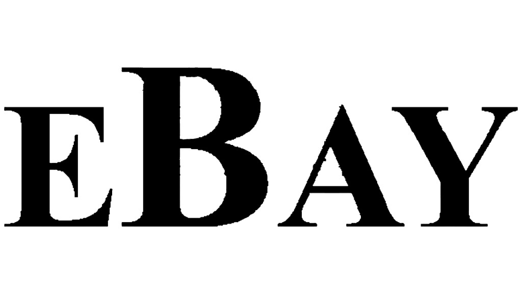
1998: Meg Whitman was appointed as president and CEO of eBay in March 1998. To customize the eBay user experience, a new program My eBay, was launched by the company. eBay Foundation was also launched to give charity to nonprofit organizations.
1999: Many new companies came into the market to compete with eBay, there was a critical for eBay, and they launched many new programs. At the end of this year, there were three million product sales in more than two thousand categories with 5.6 million registered users. The new eBay logo was also moved outside the region and expanded to different countries.
2000: eBay started building its own largest headquarters and called it eBay Park in the US. eBay started its education center to make the youth a master seller using different tactics. The company also introduced its own vehicle company.
2001: eBay became an eCommerce site with more than 12 million registered users. 4.7 million product inventory was registered over the site with instant delivery. eBay stores were also established for their sellers to open eBay stores for their customers. The monthly user of the company was half a million with an annual 4.7$ million revenue in the United States. All the major growth and biggest changes took place this year.
2002: eBay merged with PayPal and allotted Rajiv Dutta the role of president. For PayPal instant growth and global digitalization make it easier for the user in their transactions. eBay started its campaigns in Japan and started operating there.
2003: Through the PayPal Buyer Protection initiative” transactions over eBay became more secure and convenient. The company raises $500 million for different charities across the globe. The book eBay Bible was also published by Jim Griffith. eBay was the fastest-growing company worldwide.
2004: eBay started running ads for different small businesses to generate leads for them. This added much to the annual revenue of the company. The net revenue of the company this year was $3.27 billion which was double the previous year.
2005: eBay welcomed John Donahoe as the president of the marketplaces of the company. The company launched a new classified advertisement site to connect people searching for the same goods and services. Moreover, Products were categorized into 46000 categories throughout the world.
2006: PayPal launched its first mobile application this year and Rajiv Dutta was appointed as its president. The most expensive item with $168 million worth was sold on eBay according to sources.
2007: eBay becomes the world’s biggest marketplace for selling tickets online. eBay Green Team was debuted to make the environment friendly with thousands of employees.
2008: John Donahoe became the first President and CEO of eBay Inc. eBay also launched its mobile application and achieved the status of the first eCommerce site to introduce its application for iPhone and Android. The company also expanded its network of employees up to 15000 to accommodate the millions of registered users.
2009: The company launched WIN (Women’s Initiative Network) to support women and give them equal chances in the company. The top-rated Seller Status badge was given to the quality sellers to help the buyers find the most concerned seller.
2010: eBay launches its application for iPad tablets for stunning visuals and a better experience of shopping.
2011: eBay was mentioned as the world’s most ethical company and held this status for four years. Zong and Magento were merged into these companies to ensure payments and eCommerce. Devin Wenig was also announced as the new president of eBay marketplaces.
2012: The eBay logo was officially changed by the company and many new features were introduced for the buyers and sellers.
2014: Automatic translation tools were featured on the site to help people read about the products in their native language. Flipkart also started using the eBay platform for outsourcing globally.
2015: PayPal and eBay started working independently at the Nasdaq stock exchange.
2016: eBay and Flipkart became partnerships where eBay got a 5.44% stake in the company and grew its assets in India with a $211 million investment.
2017: To avoid frauds eBay introduced guaranteed delivery for buyers within 3 days without getting a membership. This year eBay also launched plenty of new programs. To drive the high potential of shopping to make it easier for the user to find the perfect product according to their interests. Users can also search for specific products by uploading images.
2018: Ayden, the primary payment processor, will manage all the payments within the marketplace of eBay. The company also merged with Giosis to expand its business and to offer more inventory to its Japanese consumers. Through the Global Customer Experience organization, eBay introduced work from the home program to accomplish the company’s formal work.
2019: eBay raised $102 million for charity to connect sellers and buyers more effectively. The payment process can be completed now through Google Play. Charities of almost $1 billion were raised for the non-profit organizations of the world.
2020: Jamie Iannone became the CEO of the company in April 2020.
2021: The company is still striving to get the most valuable and prominent place in the eCommerce industry.
Final Words:
After going through the history of eBay and the eBay logo we have concluded that eBay struggled hard to gain more effective status in society and is still struggling to fulfill all its goals and to bring the sellers and buyers closer together. The logo also holds a deep history and superiority while being old. Timely updates in the company logo and its operations ensure its workability with users of all time. Some companies observe major dropbacks for making changes in their sales. Hence, eBay claims these changes great for its operations productivity.
FAQs:
When was eBay’s first logo introduced?
eBay’s original logo was introduced in 1995 when the company was founded.
How has eBay’s logo evolved over the years?
The eBay logo has undergone multiple changes to reflect the company’s growth and design trends, with redesigns in 1997, 2012, and other significant updates.
Who designed the new eBay logo in 2012?
The new eBay logo in 2012 was designed by Lippincott, replacing the previous design by Elissa Davis at CKS Partners.
What are the key elements of eBay’s logo design?
The eBay logo design has evolved to embrace simplicity, and tidiness, and adapt to changing design trends over the years.
How did the eBay logo impact the company’s brand identity?
The eBay logo reflects the company’s growth and has played a crucial role in shaping its brand identity.


