Common Site Structure Mistakes & How to Avoid Them

As Google continuously evolves its search algorithm to provide users with the most relevant and useful information, websites and online businesses also need to invest time and effort in the latest SEO techniques. Site structure is one vital element that can greatly impact SEO efforts.
What is Site Structure?
It is all about organising different elements and contents of your website for improved user experience. Site structure is a practice of grouping, categorizing, and linking different pages and posts of the website to help visitors find the required information or details easily.
A well-structured site helps users find their way more effectively and allows Google to index your URLs better. The structure of your website shows search engines which pages or posts of your site are important.
Common Site Structure Mistakes and Tips to Avoid
Setting up a great site structure can be difficult, especially when your website keeps growing and there are a lot of posts and pages to manage. In this article, I have listed some common site structure mistakes and how you can prevent them to provide your users with an improved browsing experience.
Hiding your Cornerstone Posts
Cornerstone articles or posts are the more important and relevant posts that shouldn’t be hidden from the home page. These articles show the core purpose of your website. That is the reason, you should keep them on the top so visitors can have a good idea about your site or blog and find the required information quickly. Hiding the cornerstones is one of the common site structure mistakes that you should avoid at any cost.
Make cornerstones visible on your site and link in other relevant posts. Also, make it easier for your visitors to navigate cornerstone articles in one or two clicks.
Ignoring Breadcrumbs
Breadcrumbs play a significant role in making your website awesome and easy to navigate. Breadcrumb is usually known as a small path positioned at the top of the webpage to let the user know where he or she is on the website. It not only indicated where the user currently is on the website but also helps search engines to understand how your web pages and posts are organized & structured.
A user can easily go to the main category to get more useful and informative stuff about a particular topic or subject. Most of the websites are not using breadcrumbs that make it hard for users to go through the website.
Using breadcrumbs on a WordPress website or blog is easier than ever before because different SEO plugins allow you to add them to your site. However, you will need to hire a reliable web development company to get the job done efficiently.
Using a lot of Tags
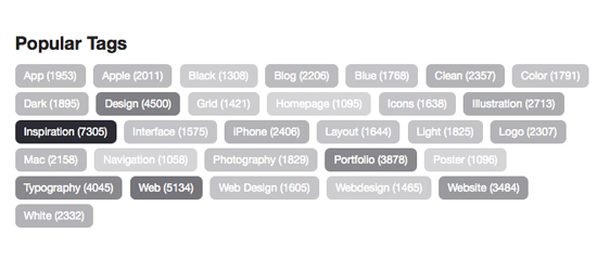
Adding more relevant tags in your web pages and blog posts is a great idea to boost your SEO efforts and appear in more search results. But using a lot of tags on your site is one of the common site structure mistakes you should avoid. People are more cautious these days and want very specific tags on the site to find important information quickly. And if you are adding so many (irrelevant) tags, then you are making it hard for your visitors to navigate your site.

You can easily fix this site structure mistake by adding a few but most relevant tags in your pages and posts. Tags are useful to help visitors find more content and information about a particular topic. That’s why always add relevant tags to help visitors find more relevant posts and pages on your site.
Overgrown Categories
Categorizing your pages and posts is an integral part of making your site structure successful and effective. But you may need to add more categories when you write posts or articles without realizing other categories on the site, you will find one of them growing faster and the other growing slower. It makes your site unbalanced.
Splitting the overgrown categories into two or more is the best way to maintain a good balance. Check the size of categories often and use subcategories to group your posts more effectively.

Not Visualizing your Site Structure
Forgetting to visualize the site structure is one of the biggest site structure mistakes that need to be avoided for better SEO outcomes. Visitors want to find the required information and stuff on your site easily. So, make sure to add popular and main categories on the home page and avoid creating so many categories to make site navigation better.
Optimizing your menus is also a great way to improve site structure and overall navigation of the site. You must keep user experience in your mind when creating a site structure to make things easier and effective for them.


