12 Reasons Why Your Website Has Poor Conversion Rate
Why are there no sales on the site?
We have collected the main reasons for low website conversion. Just open your resource now and make sure you don’t make similar mistakes.
#1. No traffic
If you’re thinking about why there’s no conversion on your website, then look first at the simplest and most trivial reason – no traffic. If there are no or too few visitors, then, of course, there will be no purchases.
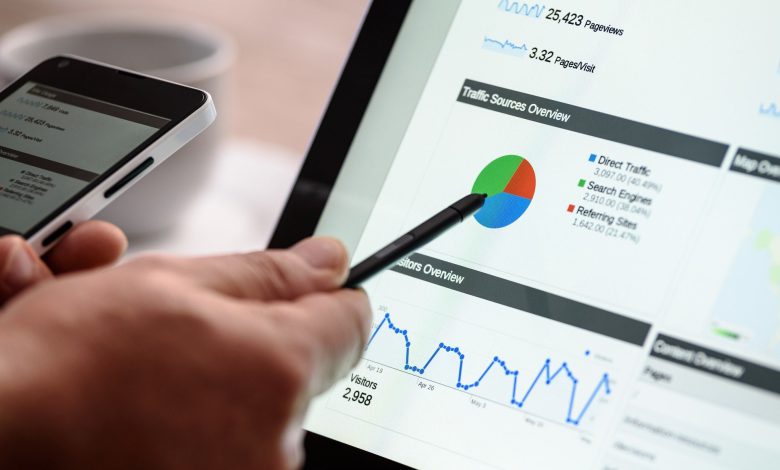
You can analyze the amount of traffic by using statistics services, such as Google Analytics, Liveinternet, and others. You can attract traffic by advertising or SEO optimization.
#2. Narrow business focus
If you sell something that is not in high demand, you should not count on a high conversion rate, even if you work within the entire country or the whole world. In that case, if the competitiveness of the niche allows, it makes sense to increase prices to recoup the business, or, if this does not work, then expand the range.
#3. Content doesn’t engage or shut out users’ needs
Readability
According to research, users read an average of 28% of the text on a page. The simpler the text is written, the more likely it is to be read. Content should be useful and easy to understand. Thus, the text is better to use subheadings, lists, and small paragraphs. It is better to write a small structured text and answer the main questions about the product/service than to write a big long read, listing all its benefits.
Of course, no one expects business owners to be good content writers either. However, if you don’t feel you have that talent, working with professional writing companies that provide do my essay service is the best possible alternative. Professional writers know how to make content more valuable and engaging.
Content placement
The most important information should be placed on the left side. According to studies, 80% of the time users visit a page, they look at the left side. This is since the bulk of the world’s population writes from left to right. But keep in mind, if the target audience speaks Hebrew or Arabic, it works the other way around: all important content should be placed on the right side.
Relevance
The information on the site should be constantly updated. You should write new news or articles on the company website, add new cases. If you have an online store, check the product cards periodically. That is, when you have no sales from your site, first of all, analyze your content.
#4. The design and layout are inconvenient for users
The first images that the user sees affect his perception of all subsequent ones. If he finds them uninformative, he is unlikely to consider other images on the site. Users simply ignore the beautiful images without meaning. If you overdo it and add too many of these pictures, it will only be annoying.
A website is often the first thing a potential customer of a business is introduced to. It should be made with elements of corporate identity, with a specific identity, and attract the user. It’s better to spend money and order a turnkey website rather than spend several times more.
Bad design and layout not only affect how users like your resource, but also how adaptive it is. According to App Annie, Android users spent more than 3.5 trillion hours on their smartphones in the 12 months of 2020 – that’s just over 4 hours a day.
People are increasingly ordering online and doing it from their smartphones. So if your site doesn’t adapt to different devices – laptop, tablet, and phone – your chances of selling goods or services drop by half. After all, in the first quarter of 2021, mobile devices generated 54% of global website traffic. This could be the main reason why you have low sales conversion from your website.
#5. Site navigation is so bad that users can’t buy even if they really want to
Creating a website is hard to imagine without easy navigation. Even if you have a good internal search, 70% of users prefer to open sections of the site first. It is worth spending time and money on a simple and clear structure at the stage of creating a resource.
Another important point is contacts. You should display a separate section for them and leave the information in other places on the site. For example, in the Header of the site or Footer. Sometimes the site does not convert because users can not get in touch with you. So leave your clients as many options as possible – application forms or feedback. And also do not forget to specify the company accounts in social networks.
#6. Complicated forms of filling in the data
The reason for the lack of conversions can be too large a form for entering data.
Don’t demand too much from the visitor at once. Don’t ask him to fill in a lot of personal data. Get at least an email address from him to start with. This greatly increases your chances that the lead will turn into a loyal customer.
#7. SEO does not work and Google does not “like” the site
It is better to create an online store from scratch in collaboration with a competent SEO specialist. This will help to avoid many mistakes, which then take a lot of time and money to fix.
Proper SEO settings help the resource to promote in search engines and give more organic traffic. Without proper optimization, the site will not get to the top of Google results, and you will not attract your potential customers. Thus, at least 51% of all active visitors come from search engines.
But what if SEO works, your site is at the top and there are no sales anyway? Then:
#8. The site takes too long to load
From a user’s perspective in 2021, this is simply unforgivable. No one likes to wait. Especially when a competitor’s site loads faster.
A few years ago there was a study that found out how download speed affects revenue per user. It turns out that if the page takes just 2 seconds longer to load, the user becomes less satisfied by 3.8%, and the number of clicks and revenue decreases by 4.3%. For a huge corporation, such a minuscule revenue per user is a multi-million dollar loss overall.
Here are the main reasons why a resource can hang:
- the pictures on the site weigh too much;
- you have turned off caching;
- your hosting can no longer support the weight of the site.
You can check the loading speed in various services, such as Google PageSpeed Insights. Do it periodically to be aware of the problem in time. Maybe even now you are losing sales simply because the site is often hanging.
#9. Elements of distraction prevent the user from taking action
Have you properly designed the page of the site, but the conversion still does not happen? Analyze the page and the site as a whole for distractions. The page offering the product/service should be thought through to the last detail, and each added element should only increase the desire and encourage the visitor to take action.
Major distraction elements on landing pages include:
These can even be offers from your site that will entice the user and take them away from the landing page. Don’t frame important information in the form of a banner. The user will just pass by this block, taking it as an advertisement.
Blocks that offer the client to buy another product/perform another action
Such blocks are often placed at the bottom of the page. The logic is – if the user was here, so he was not interested in the proposal. Then it is necessary to offer him an alternative. In fact, by offering such an alternative, you yourself put an end to the transaction. Do not offer your customer an alternative product.
Right: offer the customer additional bonuses, if the action happens here and now (it can be a free selection of the best blog content ever, a discount on accessories, or the next purchase, free additional service).
Animation elements that make it difficult to understand the information
Even worse, if the site has a soundtrack that is difficult to turn off. At some point, the user’s attention will switch to how to turn off the annoying sound.
#10. Lack of motivation for action
A/B testing allows you to determine which version of a conversion-generating page produces the best results. The comparison should involve versions backed up by motivational triggers, namely trust, need, satisfaction, etc.
#11. You don’t have a modular exit pop-up
Proper use of exit pop-up windows helps to increase the conversion rate. They appear at the moment when the user has already decided to leave the page, and offer him something interesting. Such pop-ups may well play the role of an additional landing page, attracting new customers.
To make a person want to respond to an exit pop-up, it should have a clear call to action, a catchy headline, and an attractive design.
#12. Users don’t trust you
In online marketing, a lot depends on the trust of users. In conditions of high competition, customers choose those companies whose honesty and competence are beyond doubt.
Convincing a visitor to fill out a feedback form, order, and pay for a product is no easy task. But nothing is impossible.
Several proven factors help to gain the trust of users:
- availability of SSL certificate;
- high-quality web design made by professionals;
- trust-signals (“People are talking about us…”, “Our customers:….”, “We are trusted:….”, etc.);
- third-party reviews and websites;
- reliable contact information.
Allow site visitors to believe in your honesty and professionalism, and they will gladly take advantage of it.
How to turn a low site conversion into a high one: 8 valuable tips
Follow these principles to increase conversion rates:
- Control the correct display of your site in popular browsers and their versions.
- Ensure that full contact information is available on the resource. Allow visitors to contact you in several ways.
- The product page should include detailed information about it and the price. Conversion won’t grow if the potential customer doesn’t get comprehensive information about your offer.
- List your accomplishments, awards, prizes on a separate page. For the audience, this is a good sign that evokes trust in the company.
- Take care of the availability of reviews on the site. Many people make a purchasing decision based on the opinion of other customers.
- Do not complicate the procedure for selecting and purchasing a product. Customers appreciate simplicity and accessibility.
- Make sure the navigation on the site is clear and allows the user to easily find the right section.
- Make sure the navigation can answer all of the user’s questions, or point them in the right direction to the right section.
The main things to keep in mind when creating and configuring the site are the comfort of the visitor, the ease of shopping, meeting the needs of the target audience. Compliance with these rules with the help of a large arsenal of webmaster tools will ensure an increase in conversions and profitability of the business as a whole.