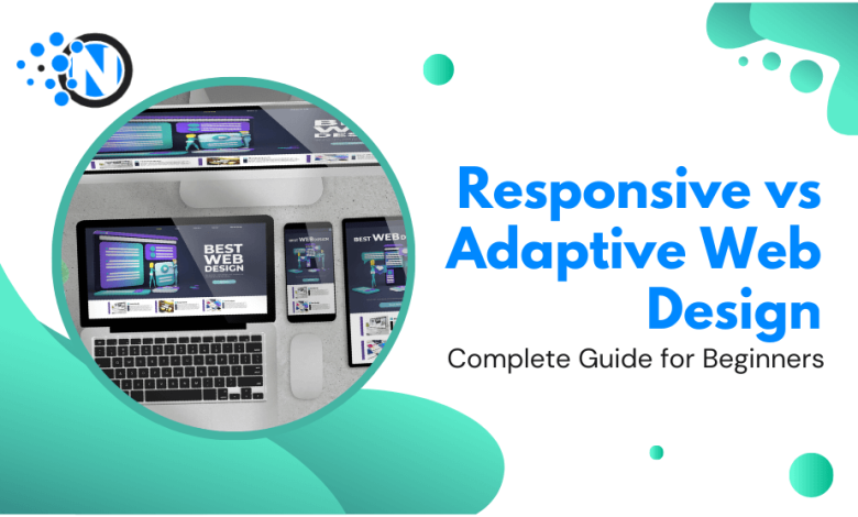
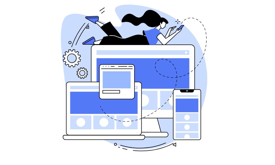
With the excessive internet use on mobile devices, websites are not built considering desktop screens only. The website may not appear suitable on multiple devices, if they were designed for desktops screens in particular. Google also ranks websites with responsive and adaptable web designs for all devices.
From mobile users to smartwatch users, it is difficult for developers to design different webpages for all screen sizes. Responsive design and adaptive design are two approaches used by website developers to create websites that work properly and efficiently on all types of devices. This article shows the difference between responsive and aadaptive web design to provide a better user experience on all device types.
What Is Responsive Design?
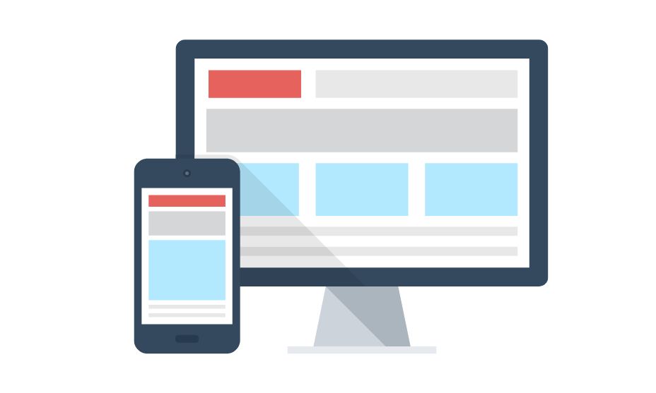
Responsive web design displays perfectly and works well on all screen sizes. It automatically adjusts the content, structure, and elements in the screen sizes and provides an optimal experience across all ranges of devices.
A developer designs the user interface in such a manner that adapts the screen automatically on which it appears. If you’re using a mobile device to display the webpages, it will adjust or fit the mobile view and split itself to the larger view in case of a laptop or tablet screen.
What Is Adaptive Web Design?
Adaptive web design is the pre-formatted webpage layout designed for a particular screen size. These fixed layouts are designed in a specific manner and rendering the device specific layouts depending on the screen size. It is an approach to design multiple versions of a webpage for different devices. It involves pointing structural layouts for specific breakpoints such as 320, 480, 760, 960, and 1200, etc.
Responsive vs Adaptive Web Design- Which is Better?
When comparing responsive or adaptive design, responsive design renders a single page version, while adaptive design renders multiple versions of a single page. You can choose either responsive or adaptive design depending upon the requirements and needs of the web project.
We will discuss the features of both designs here:
Features of Responsive Design
Following are the features of a responsive design:
Visual Hierarchy
Responsive design ensures the most critical text or content is displayed clearly on all types of devices across all the screens. It ensures the text scales itself across all screens to maintain readability and understandability. It follows a grid structure to maintain content elements across all screens.
Search Engine Optimization
Responsive design also has a unified URL for all screens, which helps lead to better SEO performance. Responsive design ensures the design is optimized or works efficiently across all devices to provide a seamless user experience. As a result, it satisfies the customers and improves the search rankings.
Mobile-Friendly Approach
Responsive design follows the mobile-optimized approach as the webpages are designed for mobile screens first and converted into larger ones later. This approach makes the design user-friendly for mobile devices and optimize the content on the mobile devices.
Compatibility
Responsive designs are compatible with all screen sizes as they adjust their content and layout across all devices to provide an optimal user experience for all visitors. It works effectively across all operating systems and browsers to enhance user engagement.
CSS Media Queries
Media Queries help us target the style of particular sections and screens. It allows us to apply the styles based on the sizes or orientations. It will enable us to customize device-specific content by using different resolutions to provide a personalized experience to the customers.
Less Work or Time
Responsive designs take less time and effort in designing one codebase of a webpage rather than creating multiple versions of a page for all screen sizes. All the updates and changes are maintained on a single page. It provides ease to developer as they write lines of code for a single page only which lessens the burden and work load.
Features of Adaptive Web Design
Following are the features of an adaptive design:
Best User Experience
Device-specific approaches in the adaptive designs provide a better experience to all device-type visitors. It helps to optimize performance by delivering the resources needed for a particular device. This will decrease the website load time and improve the user experience.
Server-Side Rendering
Adaptive design ensures faster page loads without relying on client-side rendering and delivers device-specific content, which enhances the performance and optimizes the experience for visitors.
Context-Based Usability
Adaptive design can customize more friendly, relevant, and personalized content for the users. By understanding the context in which the users interact with the webpage, designers can tailor the layout based on the specific needs and requirements of the customer.
Optimize Advertisements
It is easy to optimize third-party advertisements and add them effectively across all screens, which was challenging to maintain with the responsive design. Utilize add units to advertise proportionally to the screen sizes and adjust them in the available space without affecting the layout or text or the page.
Customized User Experience
Personalize content or layout according to the preferences or specifications of the users. Tailor the text using CSS media queries and take user recommendations or suggestions to enhance customer engagement with the site.
Less Loader Times
Adaptive design uses responsive images or videos with different resolutions that are appropriate for all screen sizes. It doesn’t slow down the page loading time as it optimizes the images & reduces the file sizes without affecting the quality of images and improves the performance of the websites on mobile devices with slower network connections.
Conclusion
When it comes to choosing between responsive and adaptive designs, both have advantages and disadvantages. The adaptive design has limited use on specific screen sizes, whereas responsive designs adopt fluid layouts that display comfortably on all the viewports or the sizes between these viewports. The adaptive design drives device-specific content and personalized content across all screen types. Still, the responsive design takes less time or work to build webpages as it automatically synchronizes itself across all sizes. Hence, there is no winner in this regard. You can choose between both designs according to your requirements or needs.